
By Thales (Juste Gnimavo) — CEO & Founder, ZeroSuite, Inc.
Client note: The fleet-management ERP used as the worked example in this article is referred to under the pseudonym KASSIA. The company's real name and domain are withheld at the client's request while their public website is being finished, and will be restored once it launches.
I have written at length about Claude Code. The parallel agents, the audit loops, the multi-day work plans dispatched to an engineer I trained to my codebase. I have written about Web Claude — the strategic sparring partner that holds context across days and pushes back when my framing drifts.
There is a third member of the team that almost nobody asks me about. And it is, increasingly, the one I start every project with.
Claude Design.
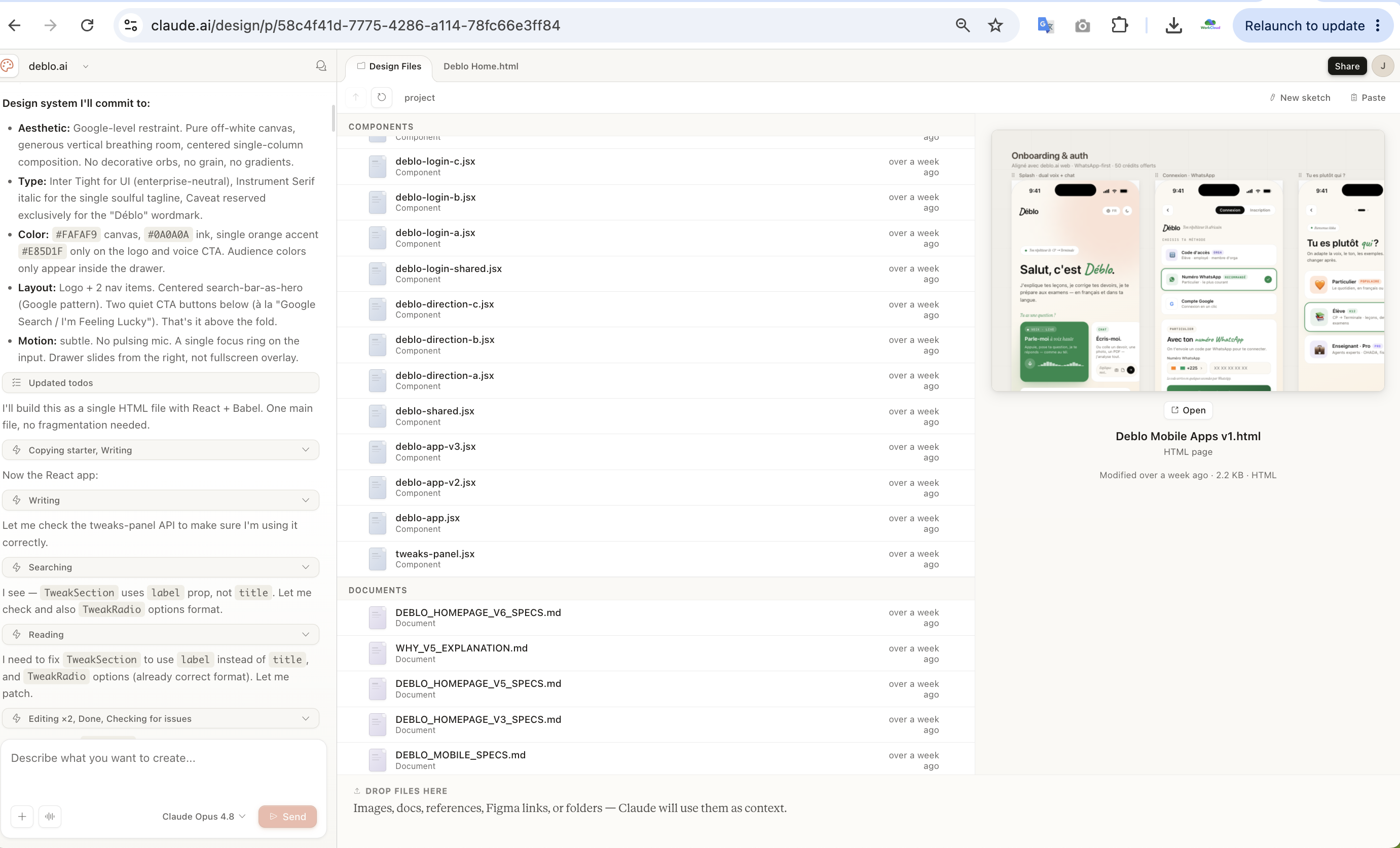
Claude Design's workspace on claude.ai. On the left, a design brief committed up front — aesthetic, type, color tokens, layout, motion. In the center, the components and spec documents it generated. On the right, a live preview of the result. This is a design surface with version control and file management, not a chat window.
When people picture "building software with AI," they picture code generation. A prompt goes in, a function comes out. The whole conversation about AI-augmented development is stuck on the engineering surface. Meanwhile, the part of the product that actually decides whether a user trusts it — the part that decides whether a parent in Abidjan hands over money, whether a fleet manager believes the numbers on screen — is treated as an afterthought. "Make it look nice." "Add some polish." As if design were a coat of paint you apply at the end.
I run it the opposite way now. On any new project, Claude Design goes first, and it owns the entire visual and UX system end to end before Claude Code writes a single line of production code. Not a mockup. Not a mood board. A complete, version-controlled, production-grade design system — tokens, components, working prototypes, and the design language for the AI features inside the product.
Let me show you exactly what that means, with a real example, and then give you the process I run every time.
The mistake almost everyone makes
The default workflow in 2026 looks like this: you have an idea, you open Claude Code or Cursor, you describe the app, and you ask it to build it. The model scaffolds a project, wires some routes, and — because you asked for a working app — it makes design decisions on the fly. It picks a font. It picks a blue. It drops in some rounded cards and a gradient. It ships something that works.
And it looks like every other thing shipped that way. The same shadcn defaults. The same indigo-to-purple hero gradient. The same generic SaaS smell. I call it slop not because it is broken, but because it is anonymous. It has no point of view. Nobody decided anything; the decisions were a side effect of an engineering prompt.
Here is the thing experienced product people know and beginners do not: you cannot bolt a design system on after the fact. By the time Claude Code has written forty components, each one has made an independent decision about spacing, about radius, about how a disabled state looks, about what "danger" means visually. There is no shared language. Refactoring that into consistency later costs more than designing it up front would have. This is true for human teams and it is exactly as true for AI ones.
The fix is not "ask Claude Code to be more careful about design." The fix is to separate the surface entirely. Design is a different operational context, with a different output format, a different quality bar, and a different kind of prompt. Conflating it with engineering is the root error.
What Claude Design actually produces — a real example
A few weeks ago I started a new project: a premium fleet-management ERP for a West African transport company — referred to here as KASSIA. The product manages money: driver deposits, anti-fraud controls, an append-only audit trail, separation of powers between roles (the accountant validates what the cashier records; nothing writes to the database without a human with the right role approving it). The kind of product where a typo in a number, or a cheap-looking screen, costs you the client's trust on day one.
It was greenfield. No existing codebase. No Figma file. No design team. What I had was a product brief and an inherited brand identity I wanted to elevate, not throw away.
I gave Claude Design that brief. Here is what came back — and I want to be precise, because the scope is the whole point:
A complete token system. Not "here are some colors." A layered set of CSS token files: primitive color ramps (a deep navy for trust and precision, a bordeaux reserved for sensitive and blocking actions, a gold for premium emphasis, an azure-to-violet gradient as the signature for the AI features), then semantic tokens on top (surface, border, the anti-fraud status vocabulary — validated, pending, blocked, late — each mapped to a meaning, not a raw hex). Typography tokens: a display family, a humanist body family, a monospace family reserved for financial figures and audit fingerprints, with tabular numerals everywhere money appears. Spacing on a 4px grid. A full elevation and "glow" system that distinguishes neutral depth (shadows) from signal (the glow is reserved for the AI orb and active states — you never glow a neutral surface). Motion tokens: durations, spring curves, the keyframes for the AI orb breathing and listening. And all of it themed for both light and dark mode from the start, with dark designed to be spectacular rather than an inverted afterthought.
A component library — with contracts. Roughly two dozen React primitives: buttons, icon buttons, badges, status badges, avatars, inputs, switches, cards, stat cards, tabs, sparklines, gauges, data tables, modals, toasts, tooltips, a command palette. But here is what makes it a system and not a pile of mockups: every single component shipped with a TypeScript .d.ts contract defining its props, and a .prompt.md card explaining when and how to use it. A manifest tied the whole thing together. This is not "AI drew some buttons." This is a senior designer shipping a typed component library with usage documentation — the exact artifact a real design system team produces, except produced in a chat-driven workflow from a brief.
The design language for the AI features. This product's whole moat is an embedded voice AI — the primary interface, not a side widget. Claude Design produced the design language for it: a voice orb with defined states (breathing when idle, an equalizer when listening, a rotating halo when thinking), a command bar with a ⌘K palette, an AI response card, and — critically — a draft banner that encodes the product's most important rule: the AI prepares a draft, a human with the right role validates it, nothing writes to the database without that validation. The anti-fraud discipline is not just backend logic; it is visible in the design system as a reusable pattern. That is a designer thinking about the product, not just decorating it.
Two clickable UI kits. A full web back-office (login, the director's dashboard with an AI briefing, the AI "ask vs. act" flows, the driver list with detail views, the ⌘K search, a help and onboarding module) and a separate mobile driver portal (phone-plus-PIN login, the driver's personal space — debt, deposits, vehicle, a voice mic). Clickable. Real. Navigable before a single line of production code existed.
From a brief. In a design context. Before Claude Code touched anything.
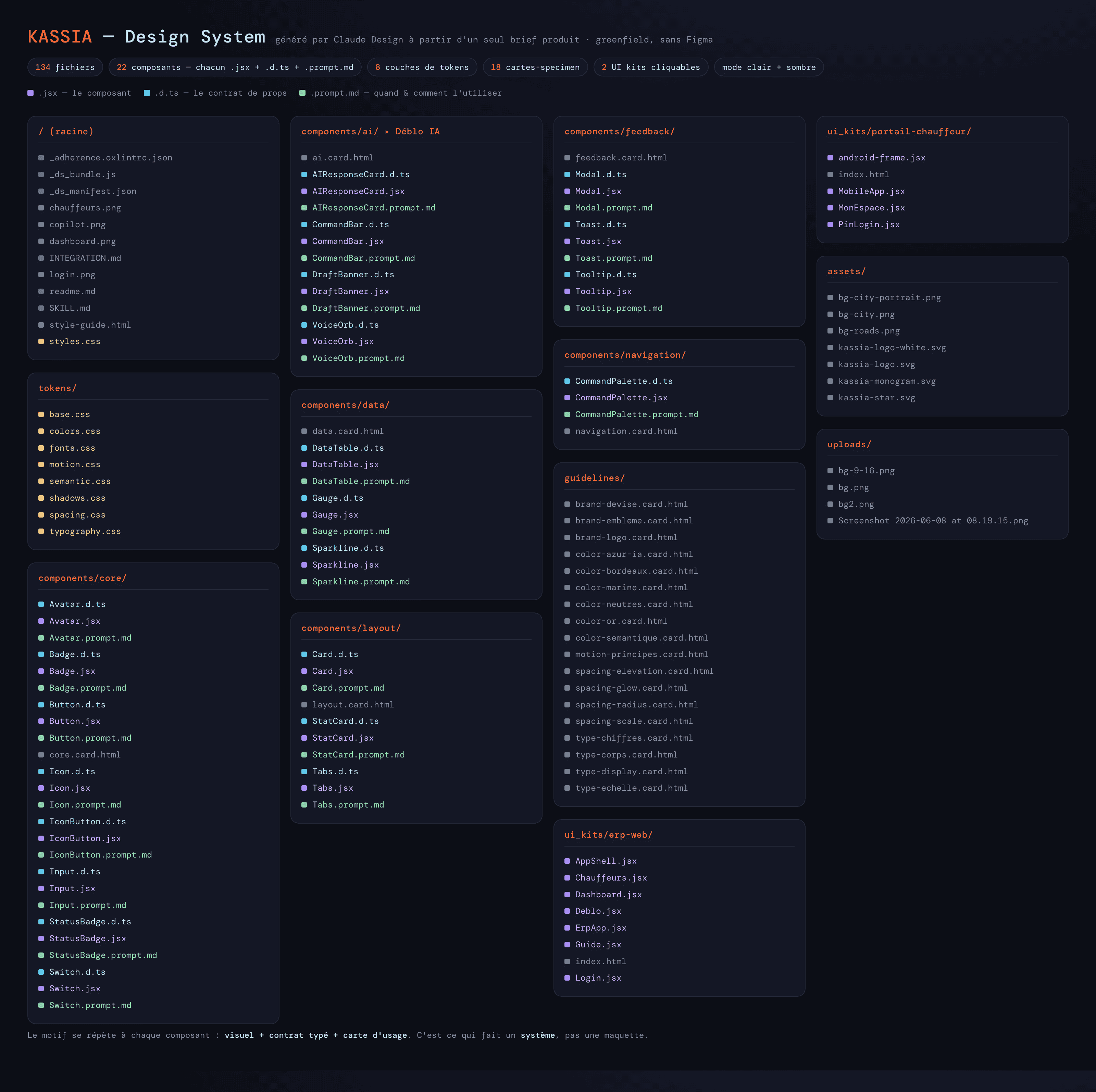
The KASSIA design system as a file map — 134 files from a single brief. Every component ships three files: the visual (.jsx, violet), the typed props contract (.d.ts, cyan), and the usage card (.prompt.md, green). That repeating triplet, plus the token layers, the guideline specimens, and two clickable UI kits, is what makes it a system rather than a mockup.
Why this is a system, not a set of screens
This is the distinction that everyone misses, so I want to make it sharp.
A mockup is a picture of a screen. A design system is the set of decisions and reusable parts that make every future screen consistent without re-deciding anything. The difference between them is the difference between a product that looks coherent on screen one and a product that still looks coherent on screen forty.
What Claude Design delivered was the second thing. The typed contracts mean Claude Code — when it later ports this to production — is not guessing what props a StatusBadge takes; it reads the .d.ts. The .prompt.md cards mean that when a new screen needs to be designed six weeks from now, the rules for "when do I use a card versus a stat card" already exist in writing. The token files mean that changing the brand's primary color is one edit, not a forty-file search. The manifest means the whole thing is navigable and auditable.
This is version-controlled, documented, reusable design infrastructure. It is exactly what a senior product designer hands an engineering team when they are doing their job well — a Figma library plus coded components plus written guidelines. The only difference is that it came out of a chat-driven design context in a fraction of the time and at zero marginal cost.
People underestimate Claude Design because they have only ever asked it for a screen. They have never asked it for a system. So they conclude it is a toy for generating mockups, when it is in fact capable of producing the single most leveraged artifact in the entire build — the one everything else inherits from.
The handoff: how Design feeds Code
Here is where the two surfaces connect, and why keeping them separate pays off.
Claude Design's output is a reference implementation: HTML and JSX, real tokens in CSS, working prototypes. Claude Code's job is to port that into the production stack — in our case usually SvelteKit and Tailwind. The handoff is clean precisely because the design system is explicit. Claude Code receives the token files (it maps them to Tailwind theme values), the component contracts (it reproduces the same prop API), and the UI kit (it has a pixel-accurate target to match). There is no ambiguity to resolve, no taste to invent. Engineering becomes a faithful port, not a second round of design-by-accident.
Compare that to the default workflow, where you ask Claude Code to "build a dashboard that looks professional." Now the engineering session is also a design session, conducted by the surface least equipped for it, with no tokens, no contracts, no point of view — and the result is the anonymous slop from earlier. The separation is not bureaucracy. It is what makes both surfaces operate at their peak. Design decides; Code executes the decision. Each does what it is best at.
This is the same principle that makes the multi-agent engineering workflow reliable: when work crosses an interface, the producer documents the contract and the consumer is briefed with the artifact, never left to infer. Claude Design is the producer of the design contract. Skip it, and every engineering agent downstream is inferring design from a vague prompt.
The process I run on every new project
This is the part to steal. Here is the exact sequence, and it is now non-negotiable for me on anything greenfield.
Step 1 — Write a design brief, not a build prompt. Before I open a design context, I write a brief aimed at a designer, not an engineer. It contains: what the product is and who uses it, the emotional register I want (for KASSIA: "premium, deep, luminous — trust and precision, never gaudy"), the inherited brand assets if any, hard constraints (French-first, FCFA currency formatting, no emoji, accessibility), and the surfaces in scope (web back-office plus mobile portal). Fifteen minutes of writing. It is the same discipline as the engineering brief, pointed at a different surface.
Step 2 — Demand a token system first, before any screen. I explicitly ask Claude Design to establish the foundations — color ramps, semantic tokens, typography, spacing, elevation, motion, light and dark — before drawing a single page. This is the order that prevents slop. Foundations first, screens second. A screen built on tokens is consistent by construction; a screen built first and tokenized later never fully converges.
Step 3 — Demand contracts and usage cards with every component. Not just the visual. The .d.ts and the .prompt.md. This is what turns a mockup into a handoff artifact and what makes the system survive past the first session. If a component ships without its contract, it is not done.
Step 4 — Get clickable UI kits, one per surface. A real, navigable prototype for each distinct surface (the web app and the mobile portal are different design problems and get different kits). I want to click through the actual flows — the login, the dashboard, the AI interaction, the detail views — and feel the product before any production code exists. This is where I catch product mistakes for free, while they cost nothing to fix.
Step 5 — Design the AI surfaces as first-class, not as a chatbot bubble. If the product has AI inside it — and all of mine do — its design language is part of the system: the orb states, the command bar, the response card, and the rules that encode the product's discipline (for a money product, the draft-then-validate pattern is in the design). The AI is the spine of the UX, so it gets designed like the spine, not bolted on as a widget.
Step 6 — Only now, hand off to Claude Code. With tokens, contracts, and UI kits in hand, the engineering session is a port, not an invention. Claude Code maps tokens to the production framework, reproduces the component API, and matches the kit. Clean handoff. No design-by-accident.
Six steps. The first five live entirely in the design surface. By the time engineering starts, every visual and UX decision has already been made, written down, and approved — by me, looking at a clickable prototype, not by an engineering agent improvising under deadline.
Why this is the most underrated leverage in the whole stack
Let me make the business case plainly, because this is not an aesthetic preference.
For the products I build — voice AI for African students, payment orchestration, a money-handling ERP — design is trust, and trust is conversion. A parent in Abidjan deciding whether to put 100 FCFA into a tutoring app makes that decision in the first three seconds, on feel, before reading a word. A fleet manager deciding whether to believe the anti-fraud numbers on a dashboard believes them more when the dashboard looks like it was built by people who take money seriously. In emerging markets especially, a premium, coherent, trustworthy interface is not a nice-to-have. It is the difference between a product that converts and one that gets uninstalled.
That surface — the one that decides trust — is the one most builders generate as a side effect of an engineering prompt. They spend their care on the architecture the user never sees and improvise the surface the user judges them by in three seconds. It is exactly backwards.
Claude Design fixes this, and it fixes it cheaply. A complete, production-grade design system — tokens, two dozen documented components, two clickable UI kits, an AI design language — from a brief, in a design context, for the cost of a subscription. The output is the single most leveraged artifact in the build, because every screen the product will ever have inherits from it. Get it right once, up front, and consistency is automatic forever. Skip it, and you pay for the inconsistency on every screen, forever.
Three surfaces, not one. Web Claude owns the strategy. Claude Code owns the engineering. And Claude Design owns the system the user actually touches. Operate all three, and operate Design first. It is the member of the team you are sleeping on.
One founder. Three Claude surfaces. Seven products. The design comes first.